

Tips for Suggesting Structure in Graffiti
Suggesting letter structures is an advanced technique in graffiti that has enough versatility to be used in some simple basic ways if the artist wants. We’re going to focus on the true technique itself, the advanced form . For those who are unfamiliar, suggesting structures in graffiti is where you erase one section of a letter, then suggest it’s existence using either another letter, or some detail such as extension or exterior details. We’re going to go over the formula behind how this technique functions so that you can explore an infinite amount of ways to apply what you’ve learned.
Suggesting structures revolves around the fundamental of letter structure and details (extensions, exterior details, interior details, 3D, key lines, and drop/cast shadow). The issue is, structure is at the top of graffiti’s fundamental hierarchy, meaning it’s the most important fundamental and sacrificing structure can very literally destroy your graffiti. In fact, sacrificing structure can prevent your graffiti from even classifying as graffiti, turning it into a different art form entirely. The next thing we have to understand is that details are useless by nature in art so they need to be given a fundamental reason to exist. Keep this in mind as we move forward because this will be at the core of balancing the downsides of this technique. So what does the. actual formula of suggesting structure looks like? W
Formula
Letter structure - Drastic negative impact
Letter name weight - Drastic negative impact
Letter name positioning = Indirectly effected. Effects dont have a negative or positive impact.
Flow - negative impact
Negative space management = Adds negative space, but effect aren’t negative or positive.
Something I want to make clear is the above effects are the direct effect on letters and these effects will occur no matter who’s performing the technique, and no matter the letter. Letter name positioning and negative space management aren’t effected all too much by the technique, but your piece itself can have positive or negative effects on these two when performing the technique. You’ll have to analyze this on your own to see if your piece degrades or helps these two. Either way, you’ll have to compensate for any negative fundamentals.
Breakdown

Nero does an amazing job with suggesting letter structures in his work. We broke this piece down in our video, but lets go down each fundamental to see how he compensated for the downsides.
Letter Structure
When suggesting the E Nero uses the right side of the N’s structure to recreate the E’s strucutre. This will always result in a lower amount of structure than doing the letters normally, since both letters have to share a section of structure. This means you’re also suggesting the N’s structure as well to a lesser extent so all of the same effects will happen to the N to a lesser extent. For this reason, suggestion by using a structure to do so is not only risky, but it’s also the easier method as it appears more naturally and organically, rather than looking contrived (we’ll get into this soon). In this case, both the N and E’s structure are completed. Since both are effectively completed he’s compensated for the negative structure. One of the more important parts of this is the fact that both are also pretty simple. Had this been a wild style, then you would have to go to greater measures to compensate for structure.
As for the R, he decides to suggest structure by using an extension. The upside to this is the fact that you dont risk another letter to pull off the suggestion. This lowers the risk of destroying your piece by a significant amount, however the downsides are not at all something to take lightly. While you can use any of the previously mentioned details to suggest structure, people almost always use extensions, rather than any other option. For this reason we’ll cover extensions here. As mentioned earlier, extensions are details and details are useless by nature and need to be given a reason to exist. Its our job to use the anatomy, and formula of extensions to give your detail a reason to exist. Having the extension create letter structure is a pretty good reason to exist since it’s compensating for missing letter structure, however, you still have to make sure the extensions anatomy functions properly. If your extension doesn’t flow out of the origin, or flow at the destination then your risk the reasoning of the travel distance (rebuilding the letter) not being justified. In other words, if your extension looks wonky then your extension wont be able to rebuild the letter effectively.
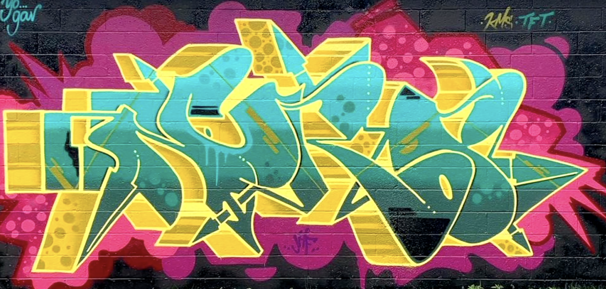
Nero has his extension begin where serifs normally spawn from, so flow here is easy. He then shoots the extension to the right and rounds the top for the bowl of the R and this flows with the top of the E and the extension on the O. This added flow helps to justify it’s existence. His extension ends with a straight diagonal line that flows with line uniformity that flows with the leg of the R and the bottom right of the E. All of this goes a long way to help make this function properly.
Letter Name Weight (LNW)
This one is pretty straight forward and one of the easier to fix. We’ll be looking at the E, R and even the N for this fundamental. As you might imagine, if you subtract structure then you’ll decrease the weight of the letter. To counter this all you have to do is increase the weight using any method you’d like. If you understand visual weight then you’re familiar with the fact that many topics effect image weight.

Nero opts to make the bottom right of his E larger to compensate for weight here. However, he also raises the E higher and this also increases the weight. Similarly, the R has a huge leg, and the extension than makes the bowl of the R is also huge. Both of these go a long way to add weight to the R. Hows about the N though? Earlier we mentioned how using a different letters structure to suggest structure puts the aiding letter at risk and causes the letter to take on the negative side effects. For that reason the N falls victim to all the same issues as the E but to a lesser extent. As a result Nero doesn’t have to go above and beyond to compensate for anything but he still has to balance the negatives and he does with with huge extensions and lots of 3D. Both of these help to balance the weight of the N.
Letter Name Positioning / Negative Space Management
Neither of these ended up being much of an issue. With that said, you’d still have to adjust these to some degree due to the suggestion, but it’s not to any larger of a degree than you’d see in a normal piece.
Flow
Every letter uses lines, and if you start erasing large amounts of lines then your letter has less chances to flow with other letters. Not only that, but you also have less of a letter to incorporate letter uniformity as well especially if you’re using structure to suggest since two letters will share a basic box. Whats awesome though is that we can spin this to benefit us rather than hurt our piece and that directly compensates for flow.

Lets address the N as our aiding letter, and the E as the suggested letter to avoid confusion. We can make any aiding letter flow with a suggested letter by having both letters share a structure that is natural for each of them to have. Sometimes you might have to bend a basic box slightly to make this happen like we see on the N. This instantly increases flow between the two since they share a structure that looks like their ordinary structure. We see this with the N and E combo where the E normally has a rounded left side, and the N has a straight right side. Nero has to not only angle, but he has to bend the N slightly to give the N a rounder edge to make the E’s structure, while still maintaining the verticality of the N’s structure. In the case of the ER combo, this is made to flow almost entirely from letter uniformity. Sure there is some line uniformity that helps, but letter uniformity is the biggest contributor.
Conclusion
Suggesting letter structure is a great technique to have under your belt in graffiti, but it’s not at all something your need to use all the time, or to this extent. Sometimes suggesting structure is much more subtle. No matter how you use it, you now understand the science of how it works. If you have any questions feel free to drop them down in the comments.