

How To Overlap 3D!
Overlap 3D Onto Letters!

Overlapping your 3D on top of your letters is considered advanced in graffiti due to how rare it is to see, and how commonly people make mistakes with this technique. If you’d like to learn how to do basic 3D, 1 point perspective, and realistic shading then check out our graffiti online store and pick up the bundle book here.
However, in any other art form, this is considered basic and even considered fundamental. So whats the difference, why is overlapping forms so hard for graffiti artists yet so easy for any other artist? Well the answer comes in from what, and how these artists study and learn. For starters, almost all art forms put a huge emphasis on learning Forms, Space, value and shape; graffiti doesn’t. (Hint: study those topics to get better at doing overlaps).
This is key for overlapping letters as you’ll have to understand how forms occupy volume in space to convincingly draw overlapping letters. With the tutorial above you’ll learn how to overlap letters, but what are some risks we want to look out for? well one of the biggest risks of overlapping letters is the potential to cover too much of a letter’s structure when you do the overlap.
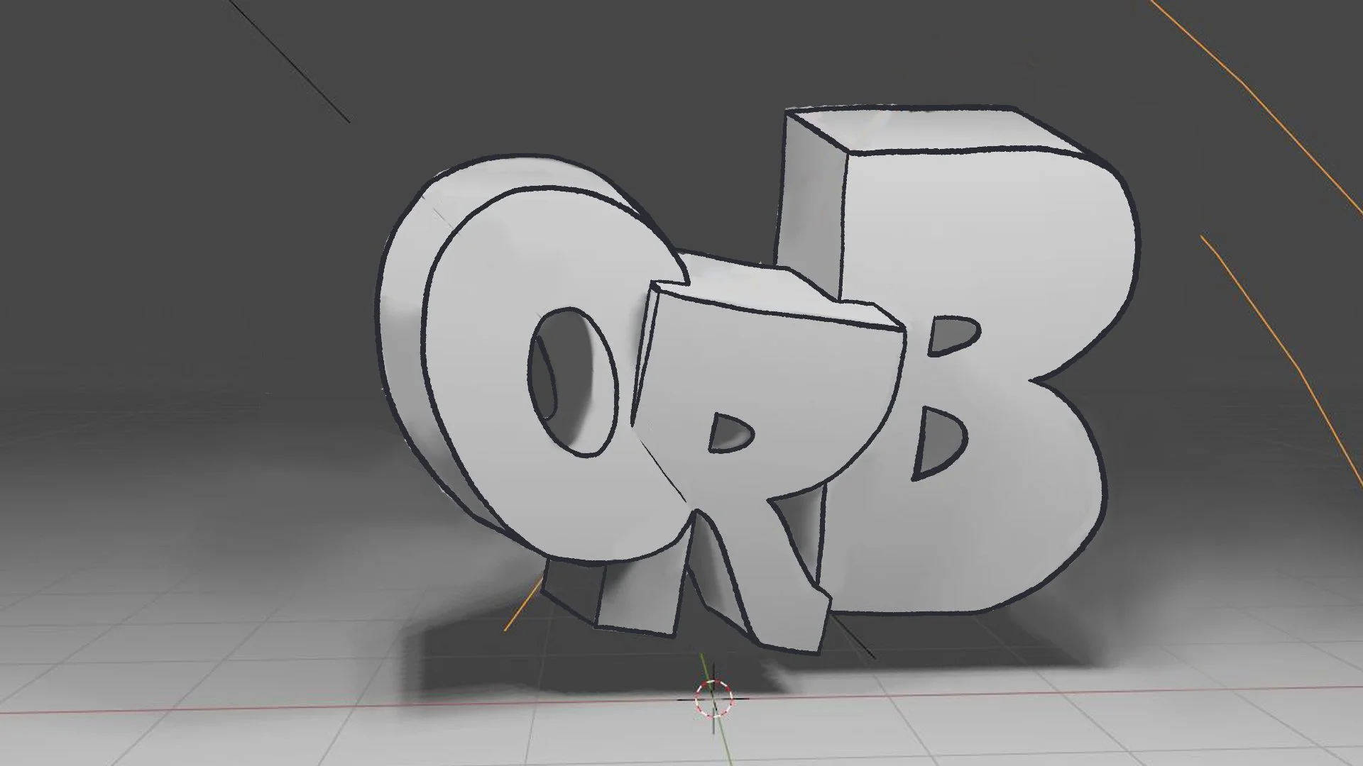

In this simple ORB demonstration you’ll notice the bottom of the O covers most of the bottom left of the R. More importantly the O covers where the stem of the R connects too, and merges with the bowl and the leg. This segments the bottom left of the R and effectively detaches that part of the letter. Covering too much of a letter can easily distort structure and end up even destroying the letter as a whole so we want to always make sure we leave at least a small gap of the letter showing underneath.


This space will allow the letter under to still show through, as a result it can finish developing it’s structure. In this case, leaving the gap allows the R’s stem to join the rest of the structure together by completing the intersection. A lesser risk is the potential to add too much weight to one side. Now you should know, this likely wont destroy structure like our previous example but that doesnt mean that you dont have to worry about risks. Adding too much weight to one side can disrupt flow, it can indicate an error with other fundamentals as well.
Working in Perspective

Say you wanted to do this same technique with the 3D in perspective, then it’s really easy because nothing about how you perform the technique changes. However, you will want to plan your letter possitioning more carefully as to make sure that you can actually see the overlaps despite the perspective. You’ll also want to be sure that the perspective overlaps dont cover too much of a letter ( this can happen very easily with perspective). Lastly you’ll want to make sure you organize your negative space well so that you can take advantage of perspective to gain more depth. In other words, dont cover all of your negative space up with 3D, leave some gaps for negative space to show through. In this one letter piece I painted, you can see we have one clear overlap at the top of the G with the chip overlapping the 3D itself. Even though the 3D is in one point perspective, nothing about how we do this technique has changed and the same will remain true for the next example.

Above we have a 2 point (left), and 5 point (right) perspective piece of graffiti I did some years ago. While these might seem much more complex than our initial examples, as you study form, value, space, and shape, you’ll learn that these are no different that what we’ve taught so far. As you study how to perform the previously mentioned topics (shape, form, value, space) you’ll feel more confident drawing in perspective. Eventually you’ll get to a point where you want to put your letters themselves into perspective. When doing this, the fundamental properties of perspective will completely change how all of graffiti’s fundamentals function. This process can be very taxing on graffiti (depending on the extent of your perspective). Do your best to maintain letter structure, above all things this is the priority. Next, letter name positioning is going to drastically change as now your letters can traverse different depths of field. This positioning will then cause a drastic decrease in negative space (this itself can come back to harm letter structure). Those are your 3 most foremost concerns with perspective in graffiti, but keep track of all of your fundamentals as each one of them will be affected.