

Basics to Overlapping Graffiti
Introduction
Overlapping letters in graffiti add depth, complexity, and visual interest to your artwork. This essential technique also allows you to experiment with each of graffiti’s fundamentals to give you new and interesting solutions to potential problems. However, understanding how to overlap letters effectively can be a challenge for many artists. In this blog post, we will break down the process of overlapping letters in graffiti by analyzing examples from different artists. Whether you're a beginner or looking to enhance your existing skills or a pro, this guide will provide valuable insights and techniques to create perfect overlaps. Let's dive in!
Avoiding Common Mistakes

When overlapping letters, it's crucial to avoid two common mistakes: obscuring letter structure and covering up too much of the underlying letter. The first mistake occurs when one letter completely covers another, making it difficult to decipher the individual letterforms. The second mistake happens when multiple overlaps result in a significant portion of a letter being hidden. Regardless, each of these decreases letter structure and that could spiral out of control into plenty of other issues. While the name as a whole might still be legible, like Aloner’s work, the letters that get drastically overlapped are diminishing the quality of the piece. In this case, the O gets overlapped by the L and as a result, the O’s structure becomes negatively affected.
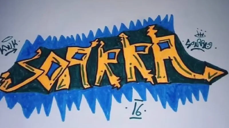
In Soarrra’s work, we can see the O overlaps the intersection of the A resulting in the left leg being detached from the top portion. A simple mistake such as this can heavily distort structure and could potentially destroy the letter itself.

To maintain clarity, ensure that each overlapping section reveals a sliver of positive space from the underlying letter, preserving its structure. This is especially important for intersections where two basic boxes connect. In Bates's work, we see this same scenario handled flawlessly. Check out how Bates handles overlaps. When he takes a letter and layers it ontop of another letter, he always leaves at least a small segment of the letter showing underneath. This goes a long way to prevent segmenting or amputating your letters.
Alternating Overlaps


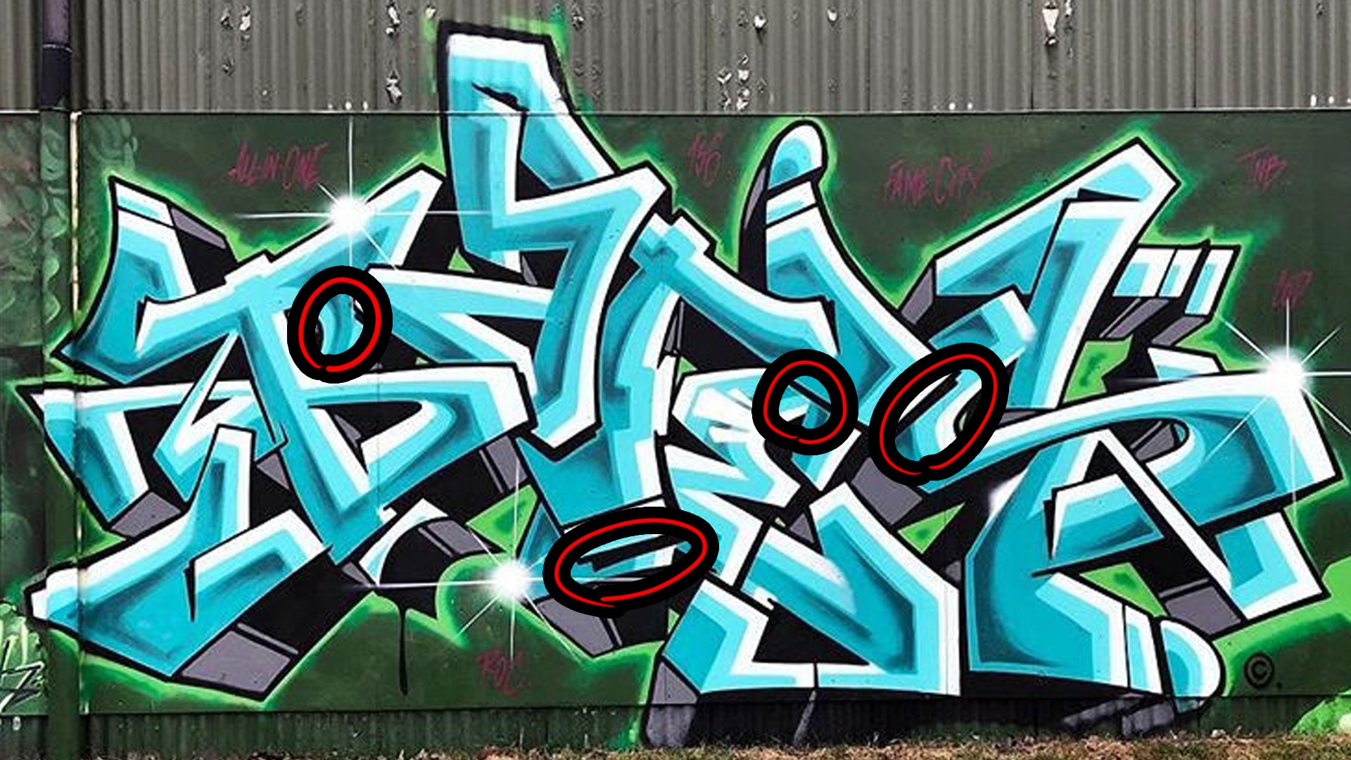
One effective technique for maintaining letter structure is to alternate overlaps. For example, in Disek’s work, they overlap the bowl of the “D” on top of the “I”, they then follow this up by overlapping the crossbar at the bottom of the I on top of the “D”. Doing this helps a letter make up for it’s lost structure. Instead, let the "S" overlap the "T" in the next instance. This technique allows each letter to retain its integrity and prevents excessive loss of structure. We can see this on a smaller scale on the “SE” combo highlighted by the red circle.
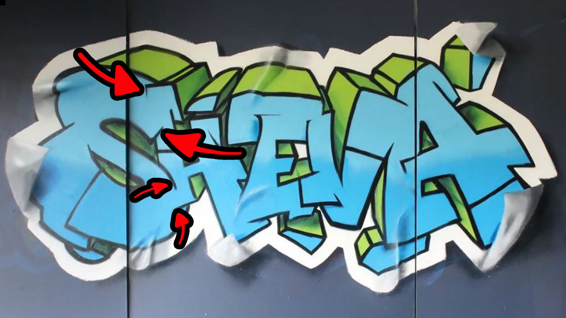
This can be done multiple times on a single letter and works especially well for connecting letters while having both letters overlap at the same time. On this Sheva piece I did, we can see at the top, the S and H both overlap one another while they connect. This connecting area allows us to mesh the forms of each letter as they overlap that way we don’t really lose much or any structure during the process. This happens again on a smaller scale at the bottom of those same letters. You’ll have to be careful though, especially when doing more realistic works that adhere to forms more accurately. Doing this too much can also cause clutter in your work so you might want to do this sparingly in more wild style or more busy works of art.
Creating Negative Space


Utilizing negative space strategically can enhance the impact of overlapping letters. Artists like Saber excel in incorporating negative space within their graffiti. By allowing letters to extend and reach out, you provide ample room for structure development. This additional negative space also permits more significant overlaps without distorting the underlying letter. The key is to strike a balance between negative space and overlaps, ensuring the letter retains its legibility and artistic appeal. If you fill the negative space too much, then you risk losing the letter, remember, negative space allows structure to exist. On the other hand, if you don’t fill enough of the negative space you’ve created then you risk your letters looking disproportionate and weak. Another danger with this is you’ll risk adding too much weight and throwing off structure for unrelated reasons such as no longer being proportioned. These are all issues you’ll have to work around if you choose to add plenty of negative space.

While there are plenty of ways to compensate for the downsides, Saber opts to use flow to bring his “B” more in line with his other letters. With the “B” in the center, it begins to act more as an anchor letter, helping to balance the name. Using more angle lines to create the structure of his “S”, he keeps this consistent with many of the other letter’s structures, shown in Red. In green we see extra lines that flow using uniformity. As discussed in the video, the size of his letters allows him to overlap easily for many reasons. All of this extra flow helps to compensate for the downsides of overlaps.
Overlaps Benefits
Using these methods to overlap can give you the freedom to work with, and fix troublesome fundamentals and letters. Say you have two letters that don’t fit well together for any number of reasons, well overlapping them could allow you to fix negative space between them. Overlaps could also let you experiment with style in new and interesting ways by way of letter name position, weight, negative space management, and yes even structure. this simple technique really dips into every fundamental, so while this does provide endless opportunities for stylistic flair, it also opens newer artists up to risks in each fundamentals.
Conclusion
Overlapping letters in graffiti is a skill that can take your artwork to the next level. By avoiding common mistakes, alternating overlaps, and utilizing negative space effectively, you can create visually striking and structurally sound-letter. Studying the work of experienced graffiti artists and delving into additional resources will further enhance your understanding and creativity. Embrace the art of overlapping letters, experiment with different styles, and let your graffiti creations shine.