

Graffiti’s Guide to Negative Space Managment!
Negative space management in graffiti has to be one of the most important fundamentals of them all, and it can be a little hard to learn. Let’s go over 3 tips and tricks you can implement to help yourself learn to control your negative space. If you want to learn all about graffiti then check out our new book that makes graffiti easy to learn.
Tip 1: Keep letters proportioned
When you begin your tag be sure your letters are a similar size, this means width, line thickness, and height. We can easily do this by either imagining our lettering chart we’ve taught in the past, (Video Here), or we can draw it before we begin. Do keep in mind, that you won’t always be able to draw your chart so try and commit it to memory. By keeping letters proportionate, your letters will create similar amounts of negative space around and within themselves. Something like this is much easier to achieve in tags where you don’t have to worry much about line thickness, but having proportioned pieces and throwies can be harder for new artists. Be sure to always double-check your letter sizes while you work. Normally, focusing on a clean base line and cap line is enough to keep your graffiti in line. Even in stylistic work, this tip holds true.
Tip 2: Use The Right Nib

This tip might seem ridiculous but it’s one that will save you when you’re getting up and when you’re practicing. By now we know that negative space creates letter structure, if it wasn’t for negative space then we would be left with a blob of ink. If you use a nib that’s too large for the surface, then your letters risk being cramped and as a result, you’ll diminish your structure as letters struggle to fit the surface. Also, if your nib is too fat, but you do a tag that’s too small, then you don’t give your open and closed counters enough room to breathe and this also results in diminished structure.
On the Opposite side of things, if your nib is too thin, then you’ll have too much space, and you’ll lose flow. Not only that, excess space makes letters look lanky and weak. Be sure your’re using the right tool for the job at any given time.
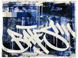
Tip 3: Use Slight Overlaps

In graffiti, we like our letters to flow with one another, its a bit of a necessity for the letters. If our letters don’t come together to make a cohesive word, then we’ve messed up somewhere along the line. A big part of flow is the proximity from one letter to another and for letters to flow, they need to be close to one another. We can take advantage of this by introducing a slight overlap from one letter to the next. This overlap will still allow for a little space, and it will bring our letters closer together so we amplify flow. You can also see, Twister has two letter Ts in his name, yet the second one doesn’t push any of the other letters away because he allows for an overlap.