

3 Warnings to New Graffiti Artists
New Graffiti artists often struggle with hand styles, whether its with letter structure, style, flow, or some other fundamental. Well in this article I’ll point out 3 things you should look out for as a new graffiti artist.
Letter Distortions:
One of the most common mistakes new graffiti artists make is overcomplicating letters. In their eagerness to create unique styles, they may distort letters beyond recognition. This often arises from attempting to emulate established artists or replicating complex styles they've seen. It's important to remember that each letter has a distinct structure that must be respected. Over-distorting a letter can lead to an end result that has no resemblance to the intended letter. When practicing, be sure to keep the letters simple and without style so that you can actually learn the letter and how it functions. This is something we see in the Brink tag above where Brink distorts the B of his tag to the point where they’ve just about destroyed the letter.
Less is More:

Another pitfall for new graffiti artists is the tendency to add an abundance of exterior details around their tags. This could be something as simple as quotation marks, crowns, underlines, bubbles, and more. While these elements can enhance a tag when applied carefully, overuse can overwhelm the viewer. Remember, the focus should always be on the hand style and the artist's name. Exterior details should serve a purpose and not be used without some kind of goal behind it. Tag and Soul’s tag show us what this might look like. Both of these are inundated with tons of exterior details that serve no purpose. As a result, this throws off not only the weight of the tags and letters, but it also throws off the flow, negative space management, and just about each fundamental.
Stylizing Every Letter:

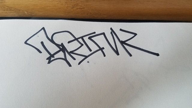
Each letter possesses its own inherent level of technicality. For example, the letter "O" naturally carries less stylistic flair compared to letters like "X," "Z," or "S." New graffiti artists may fall into the trap of stylizing every letter, which can disrupt the flow of the tag. Understanding the unique attributes of each letter is crucial. Applying style should be a deliberate choice based on the inherent characteristics of the letter. Balancing style with the fundamentals ensures a cohesive and visually appealing tag. Cosmo here stylized each letter in the tag and because of this none of the letters really flow with one another. Not to mention, the structures have become sloppy and disjointed with one another.
Learn The Fundamentals: Keeping it Simple

Ultimately, the key to overcoming these common mistakes lies in mastering the fundamentals. By grounding your practice in the basics, you pave the way for natural progression and the development of your unique style. Avoiding the pitfalls of letter distortion, excessive detail, and uniform stylization begins with a solid foundation. Embrace the simplicity of letter forms and build from there. If you want to learn the basics of pieces check out our online graffiti store for our Basics Graffiti Bundle.